The security and usability you've been looking for
I owned a 0-to-1 native mobile and desktop app that translated complex financial systems and analytics into a clean intuitive interface that solves key user pain points. This resulted in a 20% increase in trade activity, 40% increase in user retention, 95% user satisfaction rate and no incidence of security breaches
My Contributions
- Project Management
- UX Research
- User Testing
- Product Strategy
- Scalable Design System
- Wireframes & Prototypes
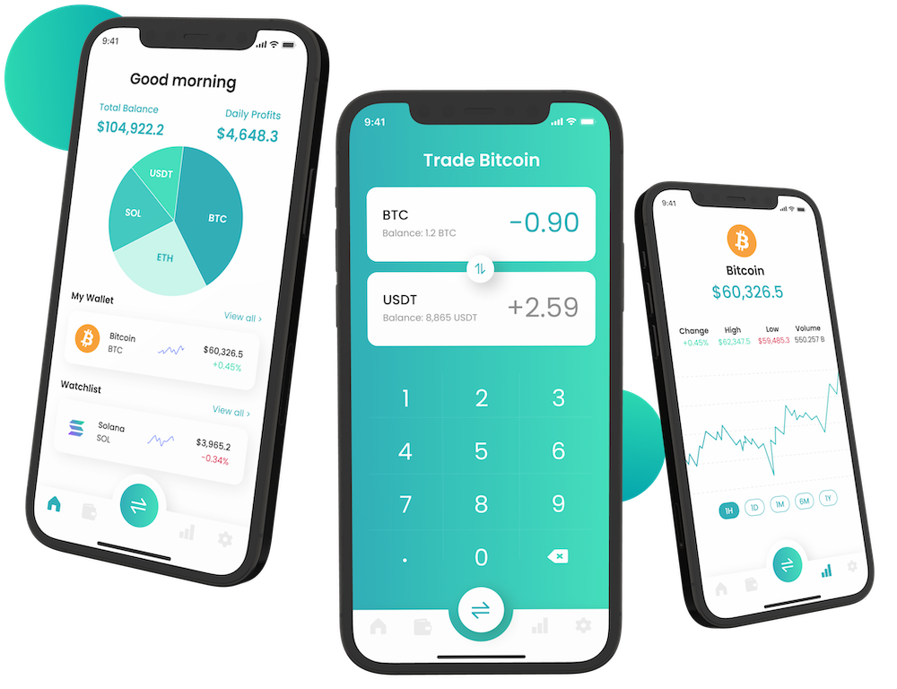
Security and Inconvenient UX
Out of 1,108 cryptocurrency traders, 40% face problems with security and 21% have an inconvenient UX with currently available exchange apps (Statista Online Survey).
Usability, Security, Functionality
1. Create a user-friendly, intuitive and clean interface
2. Ensure the security of user data and transactions
3. Motivate users to trade with functional features
Clean intuitive interface that builds trust and increases trades
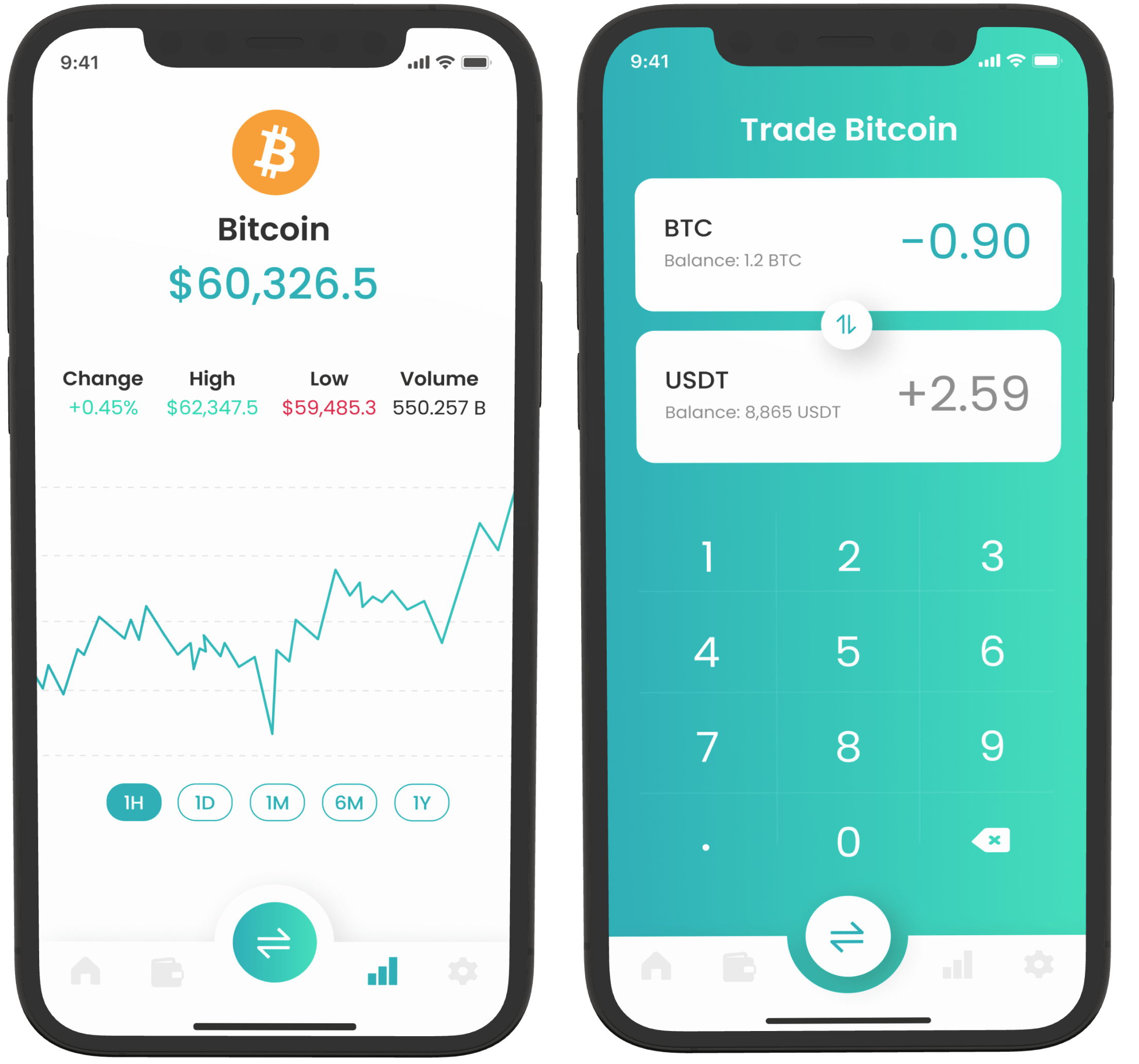
Functionality
Built intuitive, reliable functionality with clear visual indicators that translated complex financial states into actionable, high-confidence user decisions.
-
Seamless Transactions with Fiat and Crypto currency
-
Markets with Crypto price information & crypto watch list
-
Trade is easily accessible through the navigation menu
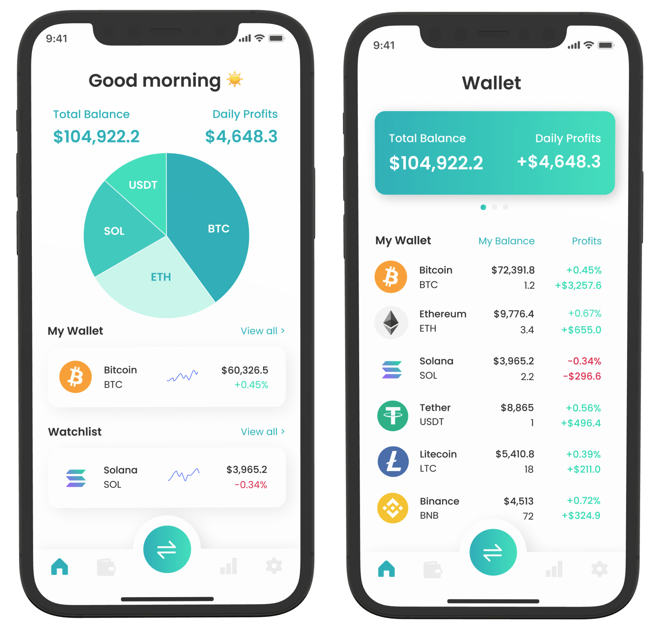
Usability
Designed a clear, easy-to-navigate data-heavy experience, reducing cognitive load through progressive disclosure and guiding high-stakes decisions.
-
Displays complex information in an aesthetically pleasing manner
-
Intuitive navigation and design structure
-
Ergonomic Design, navigation is within tapping distance of the thumb

Security
Capacity to keep financial information safe and secure to provide a reliable experience
-
Two-Factor Authentication
-
Timed logout & hide numbers after short inactivity period
-
Deny repeated payments to reduce impacts of hacking
Real-Time System Status Indicators
To improve user confidence during important financial interactions, I designed a persistent status framework that translated backend conditions into clear, glanceable visual indicators:
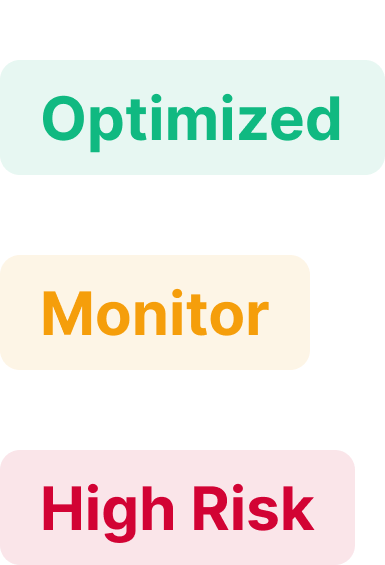 Translating volatile market conditions into glanceable system states. Allowing users to quickly interpret invisible market conditions without parsing raw data.
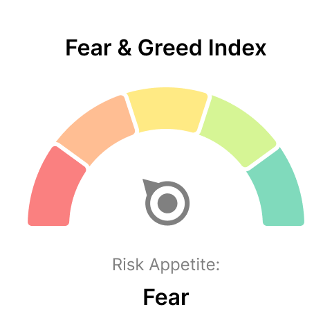 Compresses complex financial risk into an intuitive signal, enabling fast, confident decision-making without requiring users to interpret raw metrics.
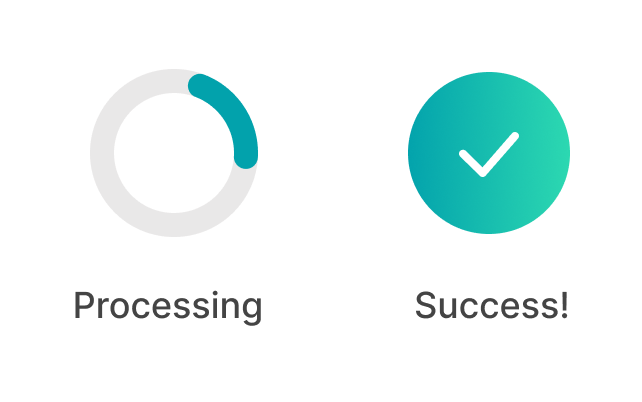 Reflects the live progress and outcome of a transaction as it moves through backend stages. Critical for building user trust as it provides immediate confirmation.
 Continuously guides a user within an active process as backend steps complete. Important for reducing uncertainty during time-sensitive transactions, preventing abandonment while actions are executing.
These system status indicators helped reduce uncertainty during high-stakes interactions and improved decision confidence.
Empathize
Understand the user problem through User Interviews and Research Expert opinions

Specify
Analyze Findings, identify goals and prioritize features based on findings
Ideate
Create low fidelity wireframes to explore design posibilities

Test
Test the design against users to gather feedback and ensure it solves a problem

Design System
Creating the Tone, Color Palette, Iconography and Typography of the brand

Finalize
Based on feedback from users, generate final designs for the mobile and desktop app
User Research
To better understand user problems, I interviewed 8 cryptocurrency traders on their experiences with currently available applications. I organized the data through affinity mapping, which demonstrated the two main themes users prioritize in cryptocurrency apps:
Theme 1: Security
The traders described they prioritized an app that keeps their wallet and account information secure, due to fears of being hacked
Theme 2: Usability
80% of the traders expressed frustration when completing tasks they desired, due to inefficient and inconvenient user flows
Functionality, Security, and Usability are the most important features of a cryptocurrency mobile app...
A WebChain software developer explained this in her article regarding the most important assets of a cryptocurrency app
Define Goals
The findings from my user interviews and expert research conclude the need for strong usability, functionality and security, as this will solve user problems and contain essential features that make a crypto exchange app successful. Below are the goals for the project:
Usability
The app should be easy and convenient for a positive user experience
- Robust UI
- Intuitive User Flow
- Most items within tapping distance of the thumb

Functionality
Essential features a crypto app must have, according to user's and expert's
- Seamless Transactions with Fiat and Crypto currency
- Trade easily accessible through navigation menu
- Markets with Crypto price information & crypto watch list
Security
Capacity to keep sensitive information safe and secured
- Two-Factor Authentication
- Timed logout after short inactivity period
- Deny repeated payments
Wireframes & Iterations
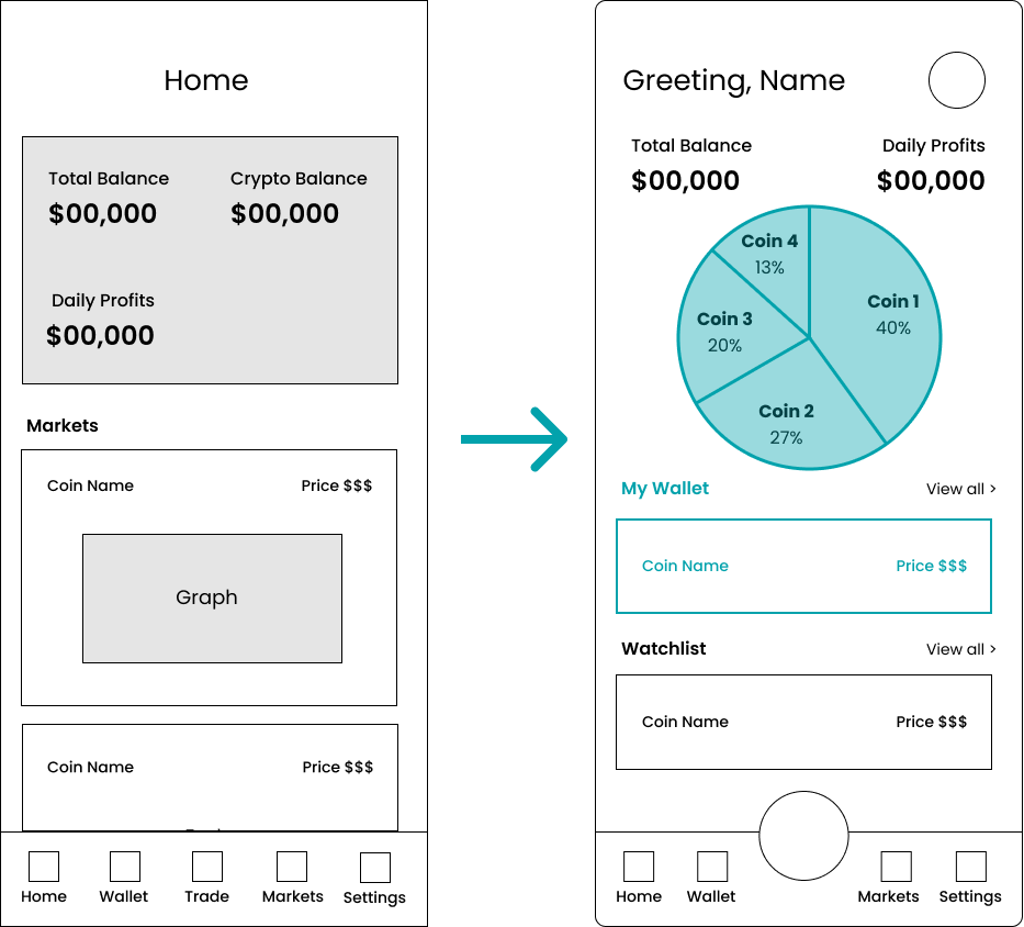
Based on feedback from stakeholders + user testing, I iterated my design with 3 main improvements demonstrated below in wireframe format:
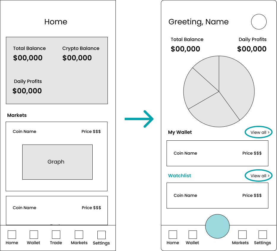
Increased Trade Incentives
Composition at First Glance
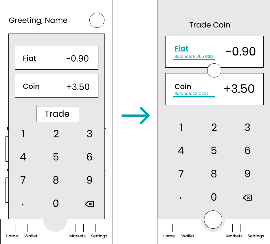
Intuitive Transactions
Design System
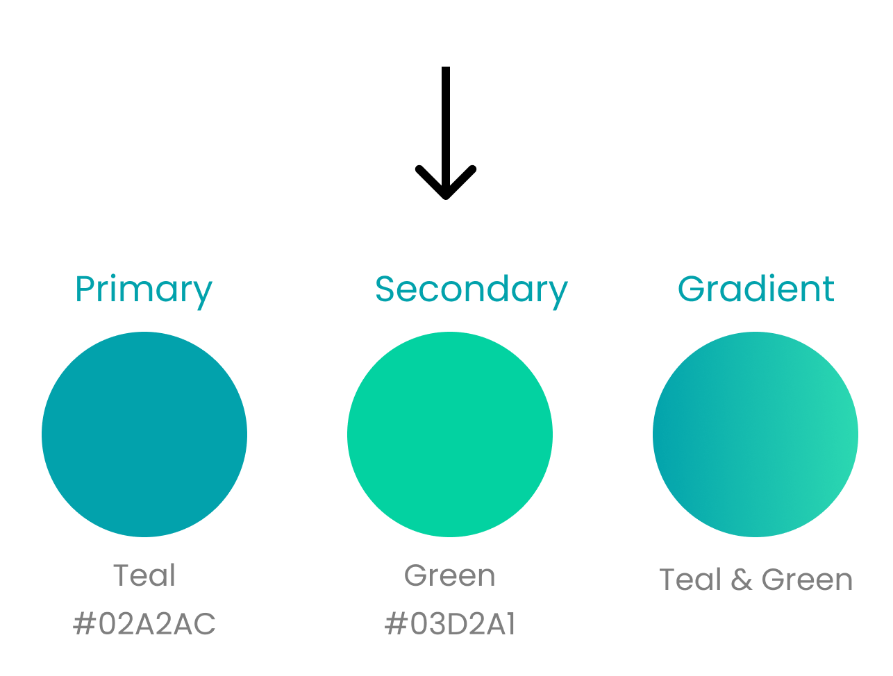
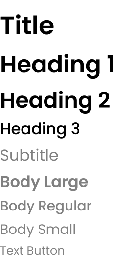
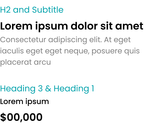
I developed a scalable design system for a cryptocurrency exchange app, prioritizing user trust due to the sensitive financial data involved. I chose teal and green as the primary colors to evoke security, trust, and calm. To reinforce transparency and confidence, I defined alert variants (Info, Warning, Critical), a consistent status badge system, clear color logic, standardized spacing, and full accessibility standards. This creates a reliable, professional, and user-centered experience.
Color Palette
I used this mood board as inspiration for the visual design of the app, as the colors evoke a sense of reliability and calmness.
I created these icons to improve the user experience, as I could
not find any existing icons fit the tone I want for this app.
This Trade Button has attractive colors that
match the app style and arrows to signify an exchange. The button is
a large size to make the option of trading easy to find.
I created these Page Icons to clearly indicate
the different pages the user has access to, while being consistent with
the design system
The Navigation Bar displays these icons I have
created, for a consistent style and color palette.
Final Screens
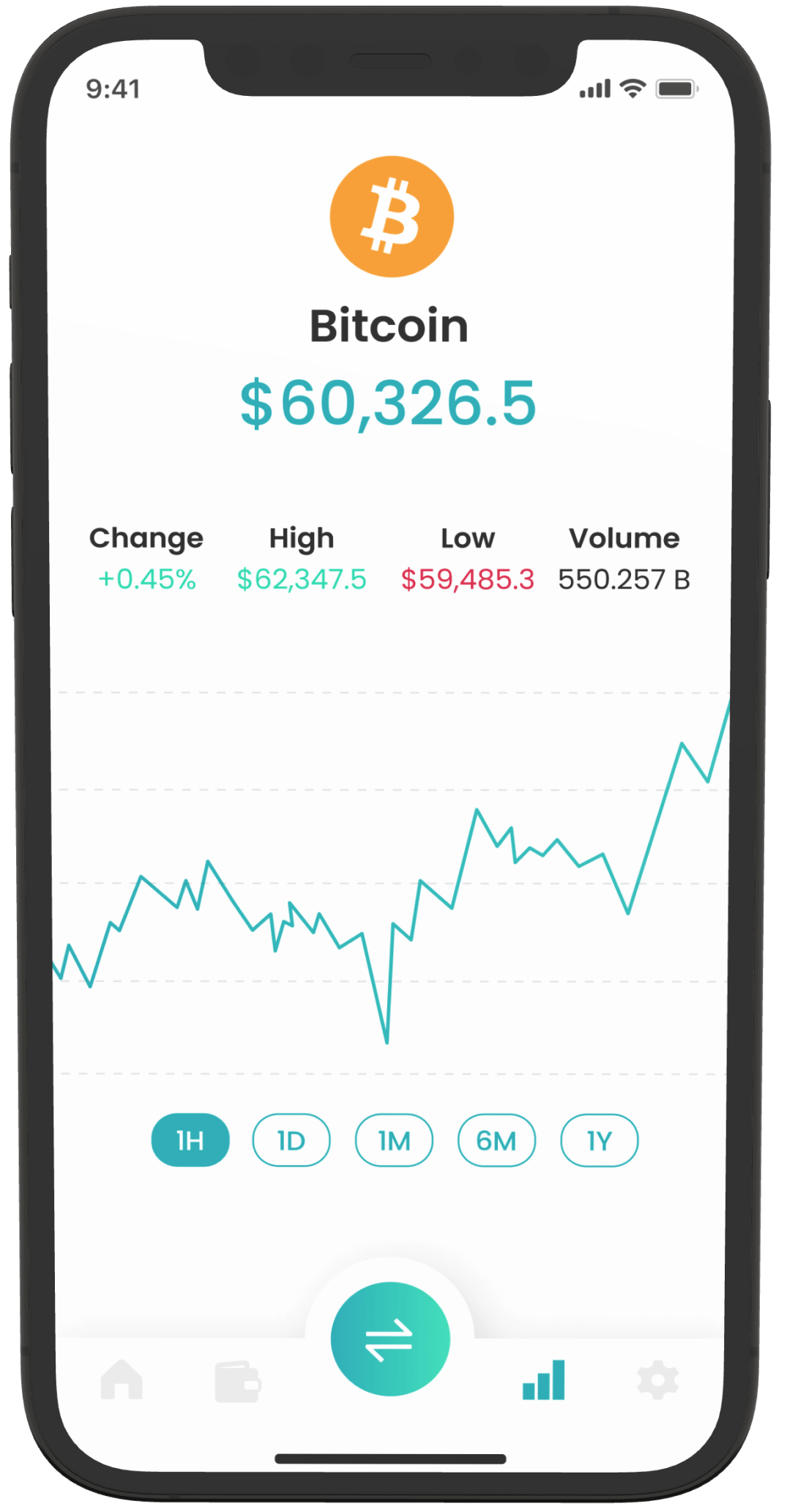
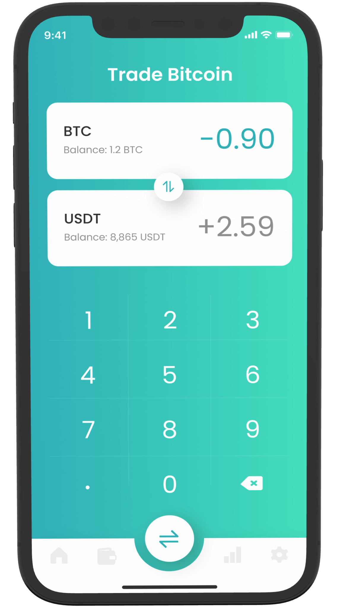
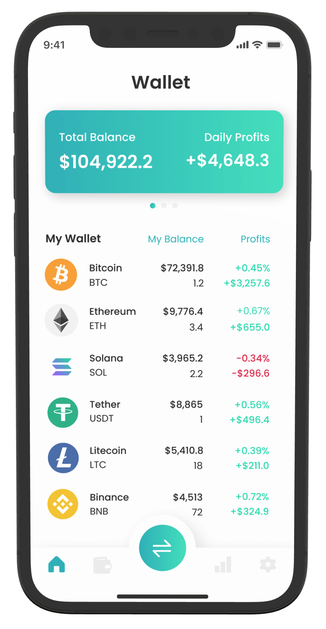
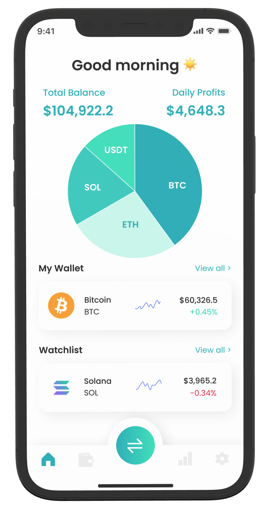
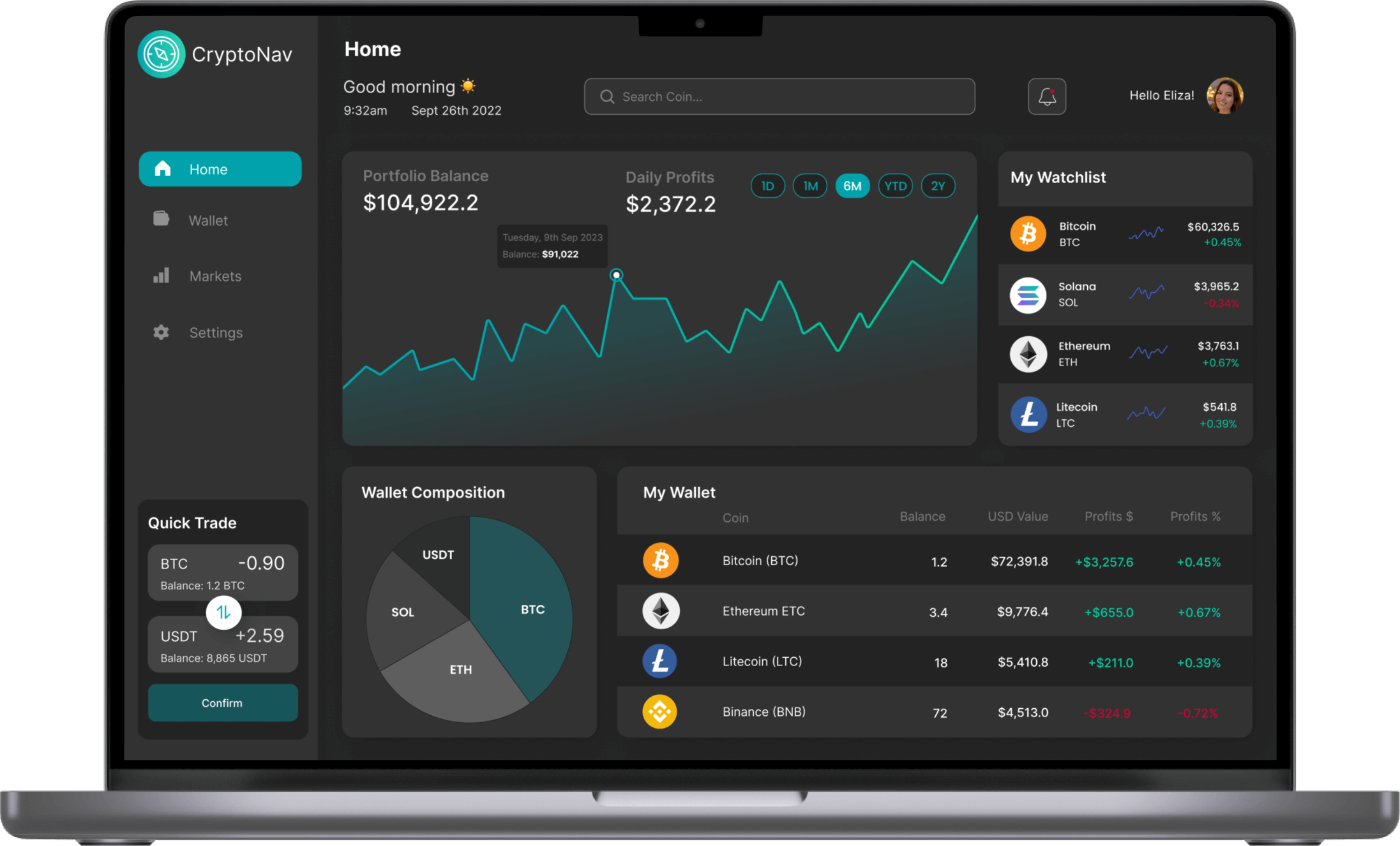
Final Desktop Screen

Results
The development of this cryptocurrency app resulted in a successful product launch with positive feedback from stakeholders. The final designs achieved project goals of solving user problems with security, usability, and delivered the following results.
Business Impact
- 20% increase in trade activity
- 40% increase in user retention
- 95% user satisfaction rate and positive feedback from users
- 0% incidence of security breaches or fraudulent activities with advanced security features
Reflection & Learnings
Include users as much as possible for successful design
Through in-depth user interviews, the users helped us prioritize user problems
and define the scope of the project. Implementing feedback from user testing resulted in final
designs that are significantly different from the original
wireframes and more effectively solve user problems. Maintaining a user-centered
approach allowed us to achieve a
95% of user satisfaction.
We could foster user retention and loyalty to the application, allowing for high business value by building a community with users, traders and investors, through in-app social features, such as chat rooms, forums and social media integration.
Next Steps: Trading education to increase trading activityThe app could provide educational resources, such as tutorials and webinars, to help users learn about cryptocurrencies and trading strategies. This would incentivize trading and promote business growth.