Redesigning a Web3 Trading and Livestream web app
Led a growth-focused redesign of Parti's core experience to reduce friction in high-stake financial transactions, strengthen user confidence through clearer feedback and progressive disclosure, and drive deeper engagement.
Results
- 30% increase in DAU
- 15% lift in conversions
- Improved feature adoption and engagement
My Contributions
- Lead Product Designer
- UX Research
- User Testing
- Product Strategy
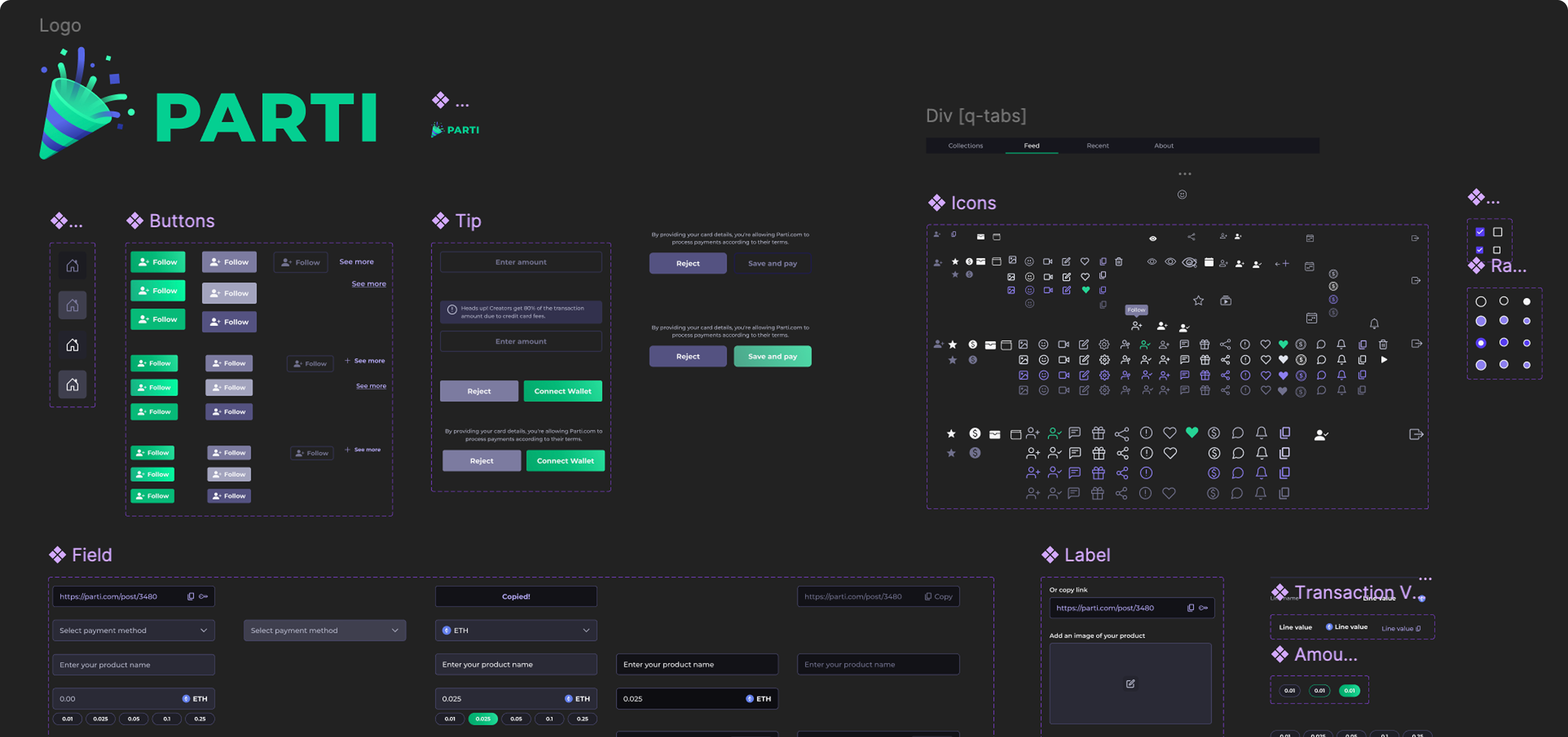
- Scalable Design System
- Wireframes & Prototypes
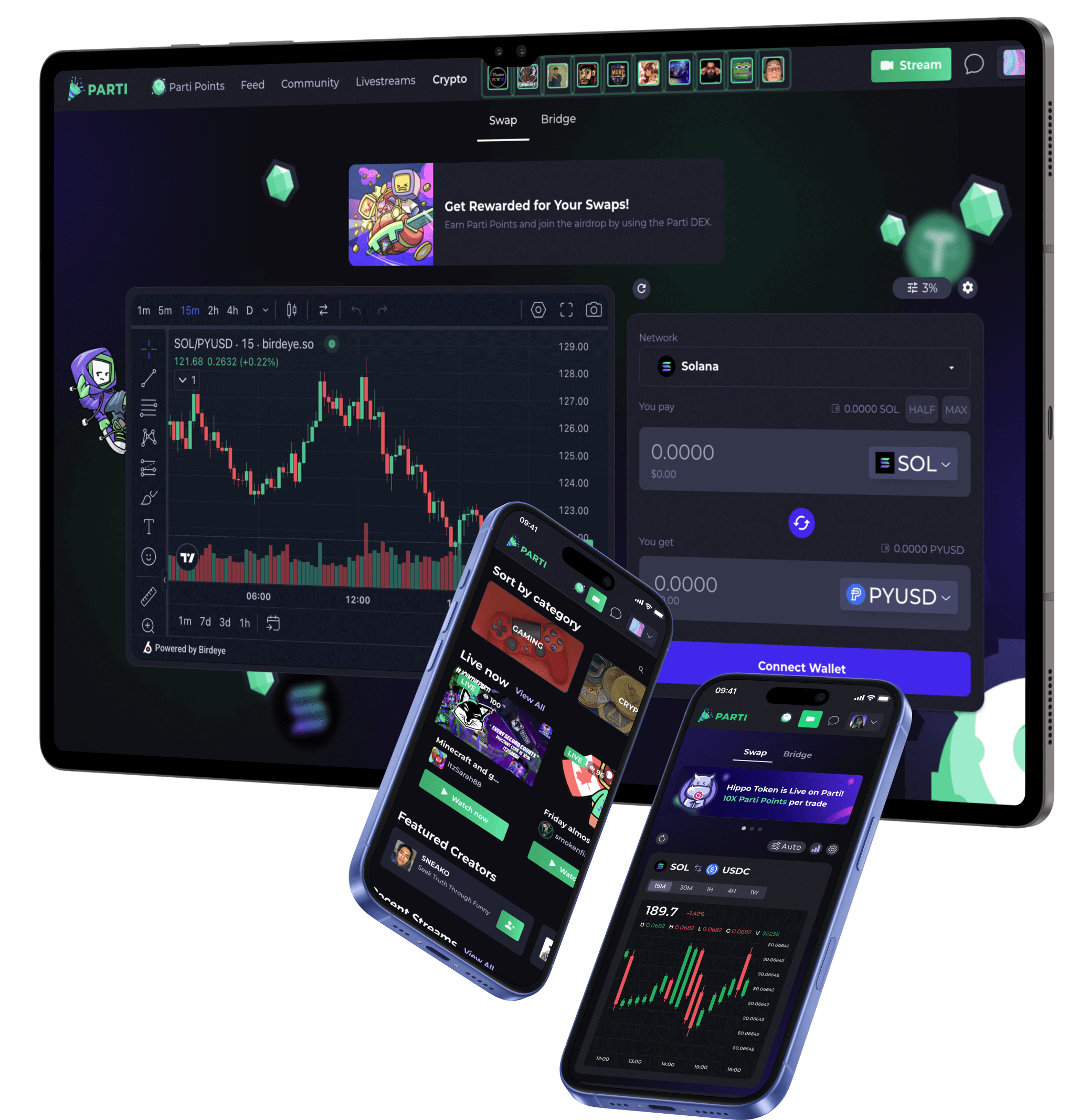
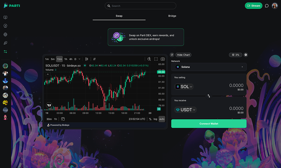
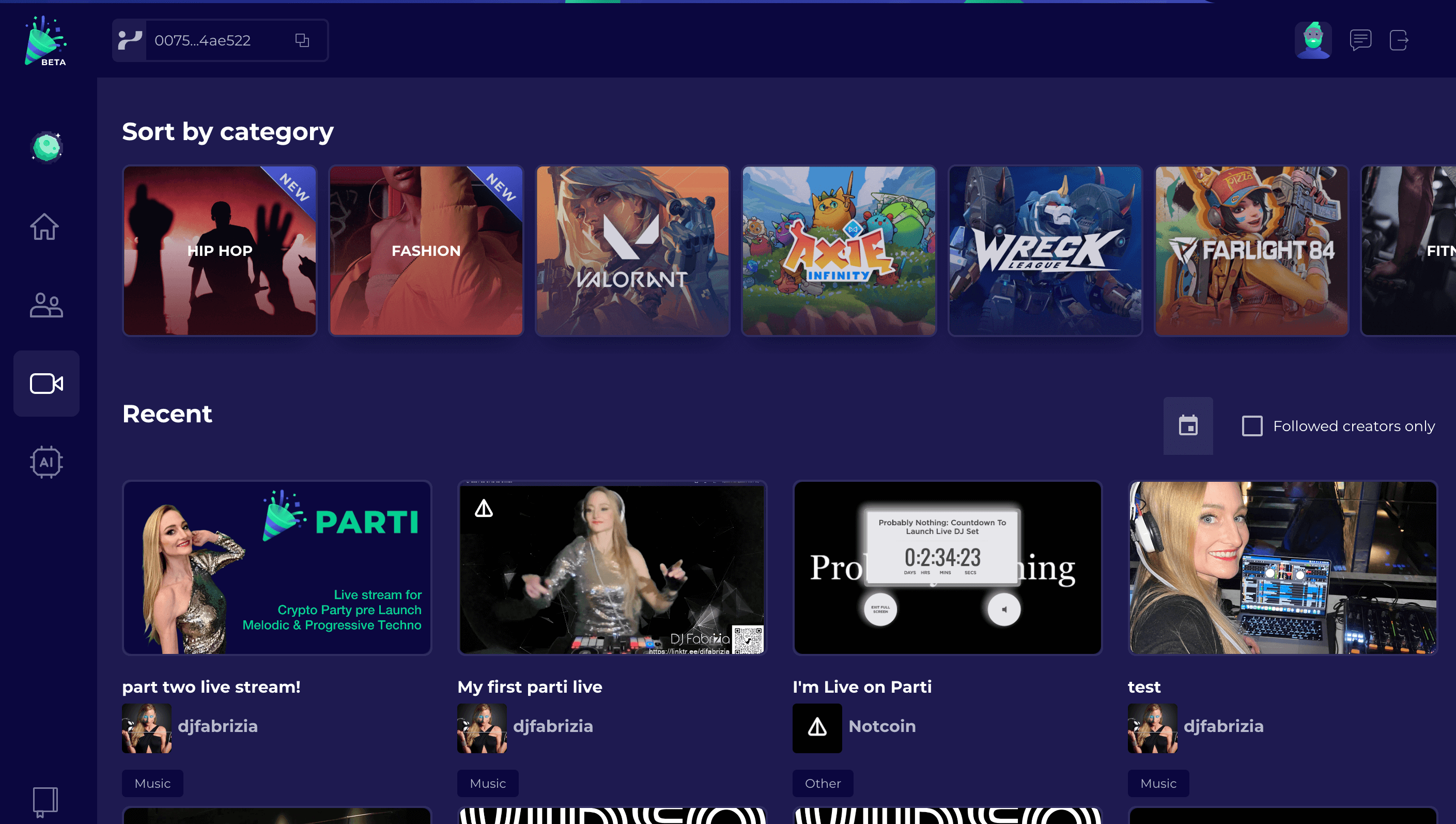
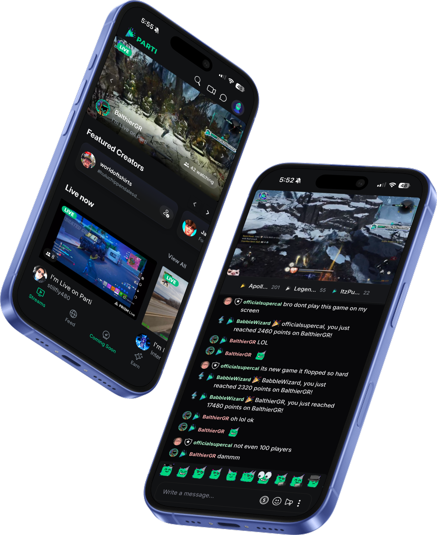
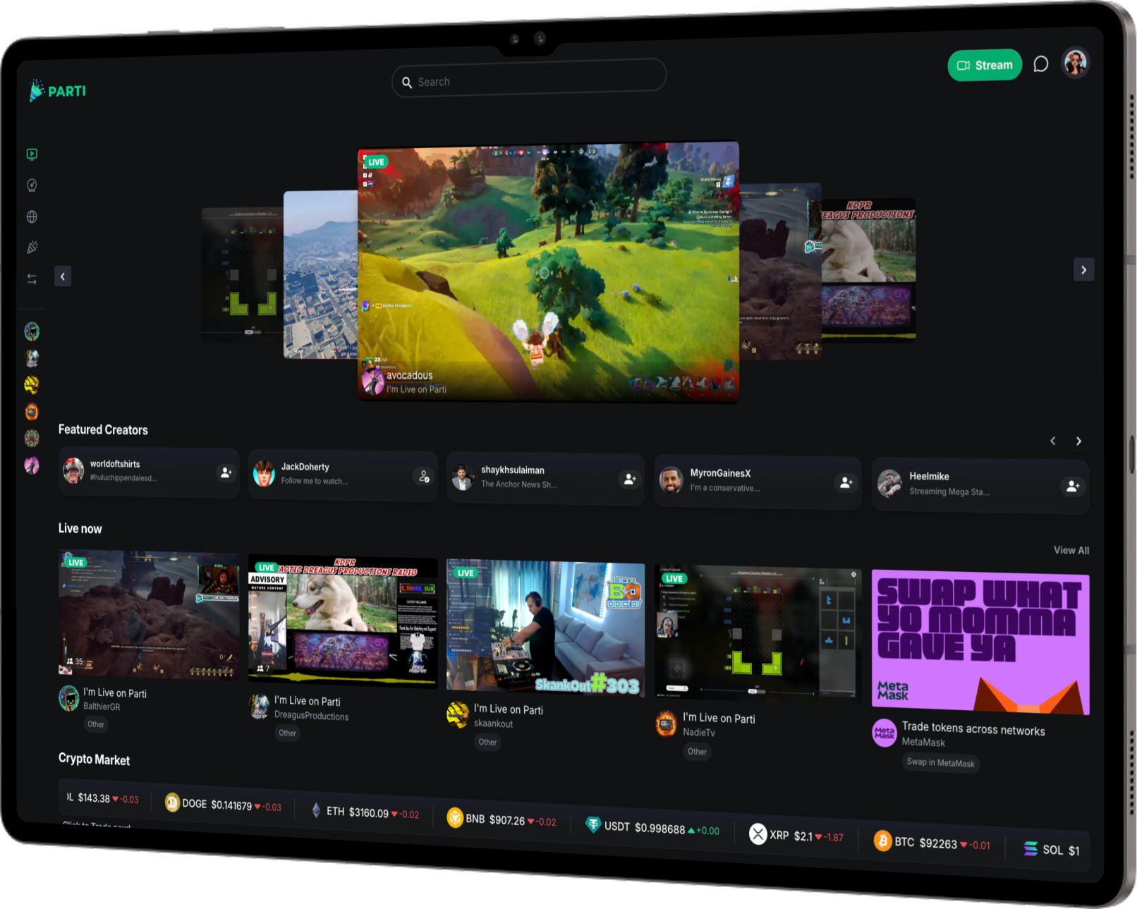
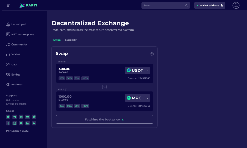
All-in-one Livestream + Web3 Trading
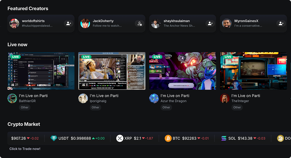
Parti combines live content, social interactions, and web3 into a responsive web app for mobile and desktop. Features: Globalized monetization through Crypto. Crypto allows for a global fanbase unlike Stripe which blocks certain countries. Access entertainment content, news, investment info and crypto trading.
Unappealing design, confusing navigation, and lack of user engagement
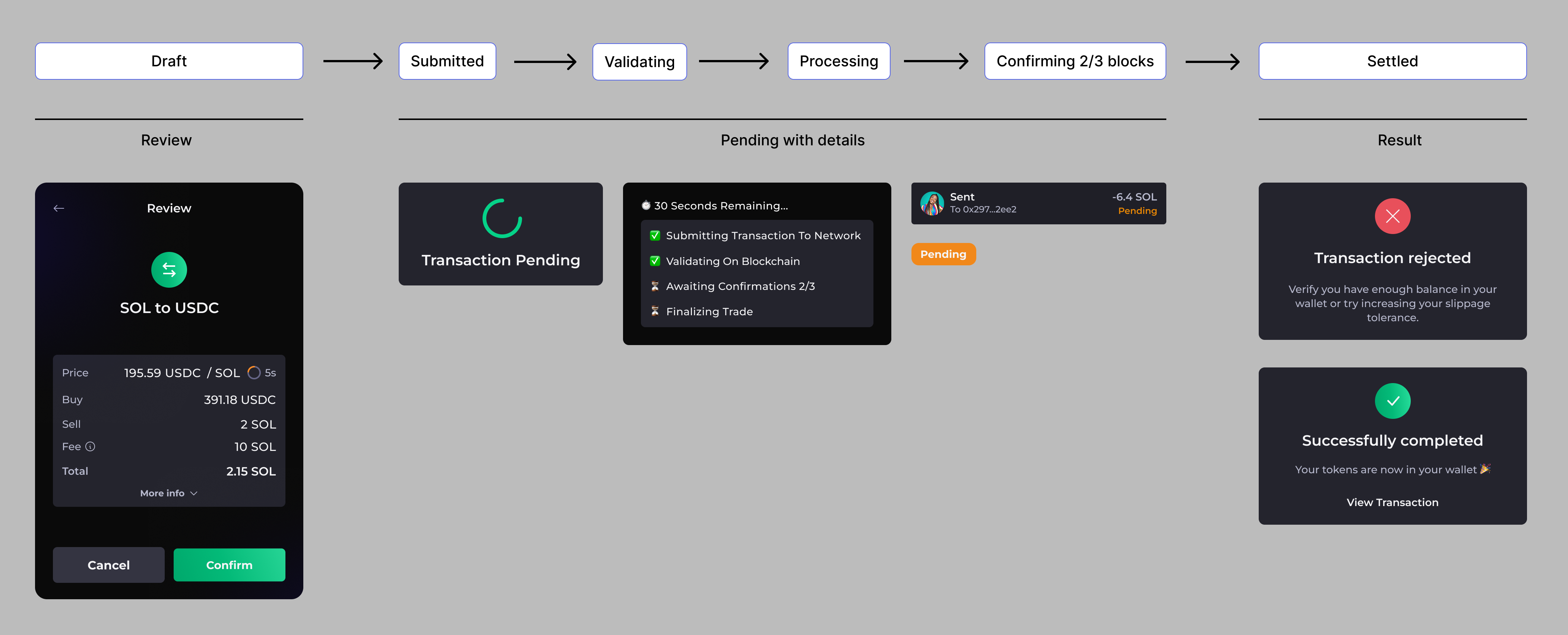
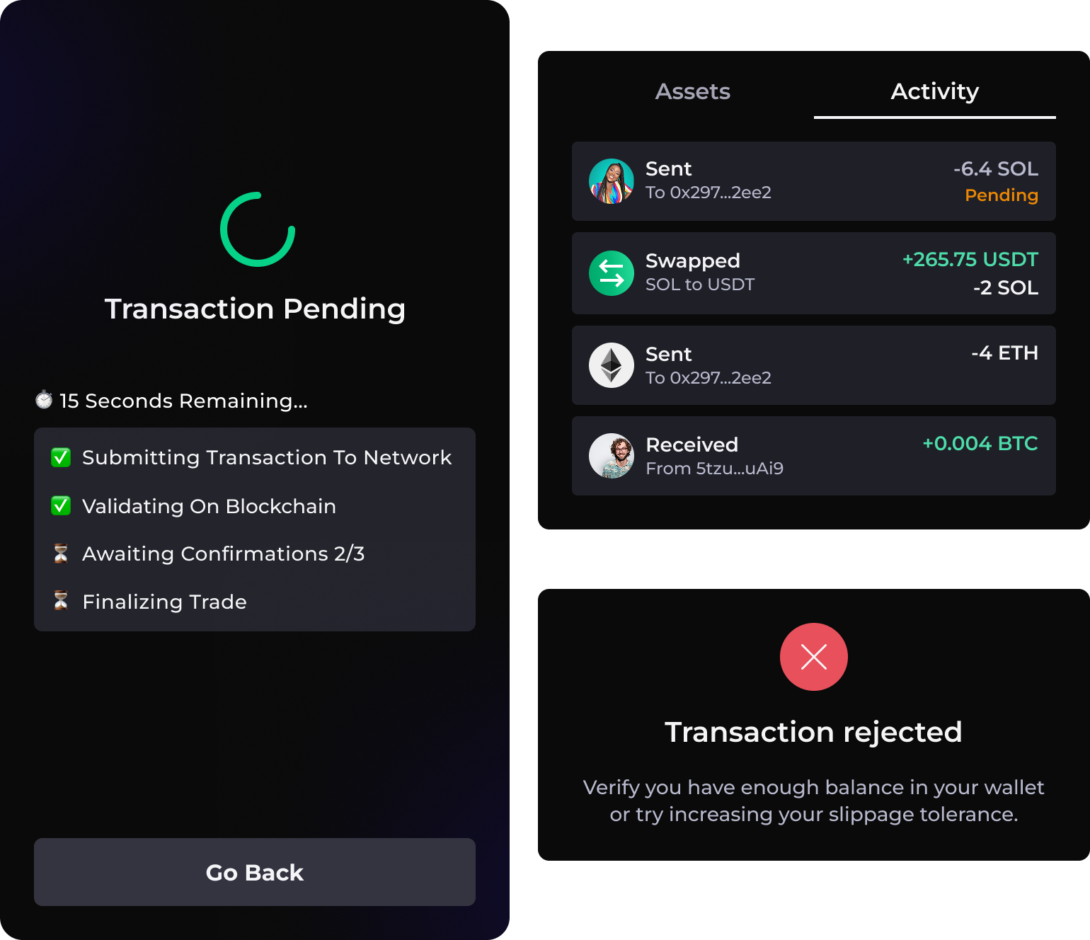
Parti is a livestream + trading platform operating in a high-risk, high-emotion environment where users make real financial decisions in real time. Users lacked confidence navigating key flows. The interface created friction in critical moments, leading to low feature engagement and drop-off in high-intent actions.
Modernize visual design, reduce friction and increase user confidence

Understand
Understand the problem through User Interviews and Market analysis

Specify
Analyze findings, identify goals and prioritize features based on findings

Ideate
Create low fidelity wireframes to explore design posibilities

Test
Test hi-fi prototypes with users to gather feedback and iterate designs

Design System
Creating the Tone, Color Palette, Iconography and Typography of the brand

Launch
Implement final solution, launch and monitor performance metrics
What do users think of Parti?
To better understand our users experience first-hand, I conducted a survey with Parti users and organized the data through affinity mapping, and the main insights of the research are below:
The site is all purple, while unique its reminiscent of older sites and deemed unattractive.
Impact: Not engaging and detracts from the user experience. A web3 platform should be exciting.
Users shared that core features (streaming, wallet, tipping) were hard to locate.
Impact: Users spent unnecessary time locating key functions, reducing engagement.
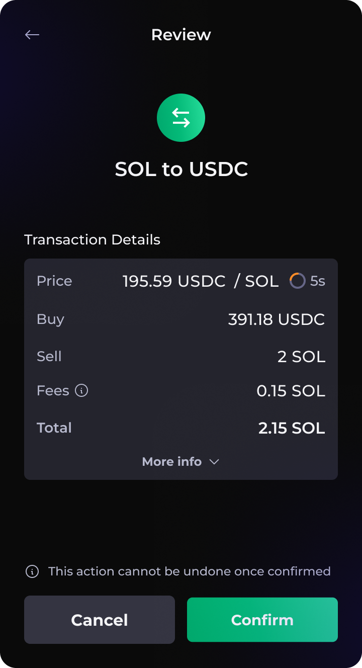
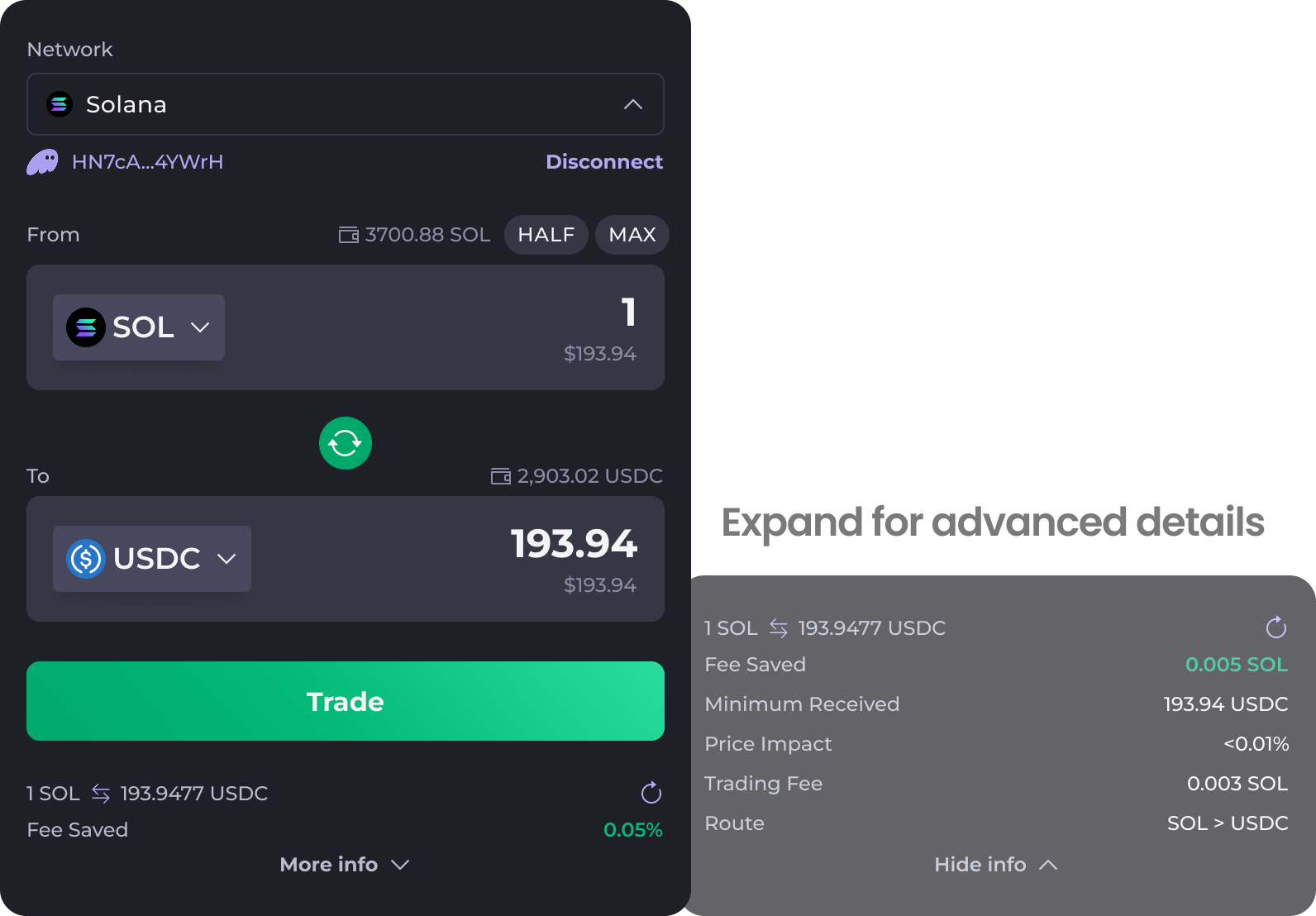
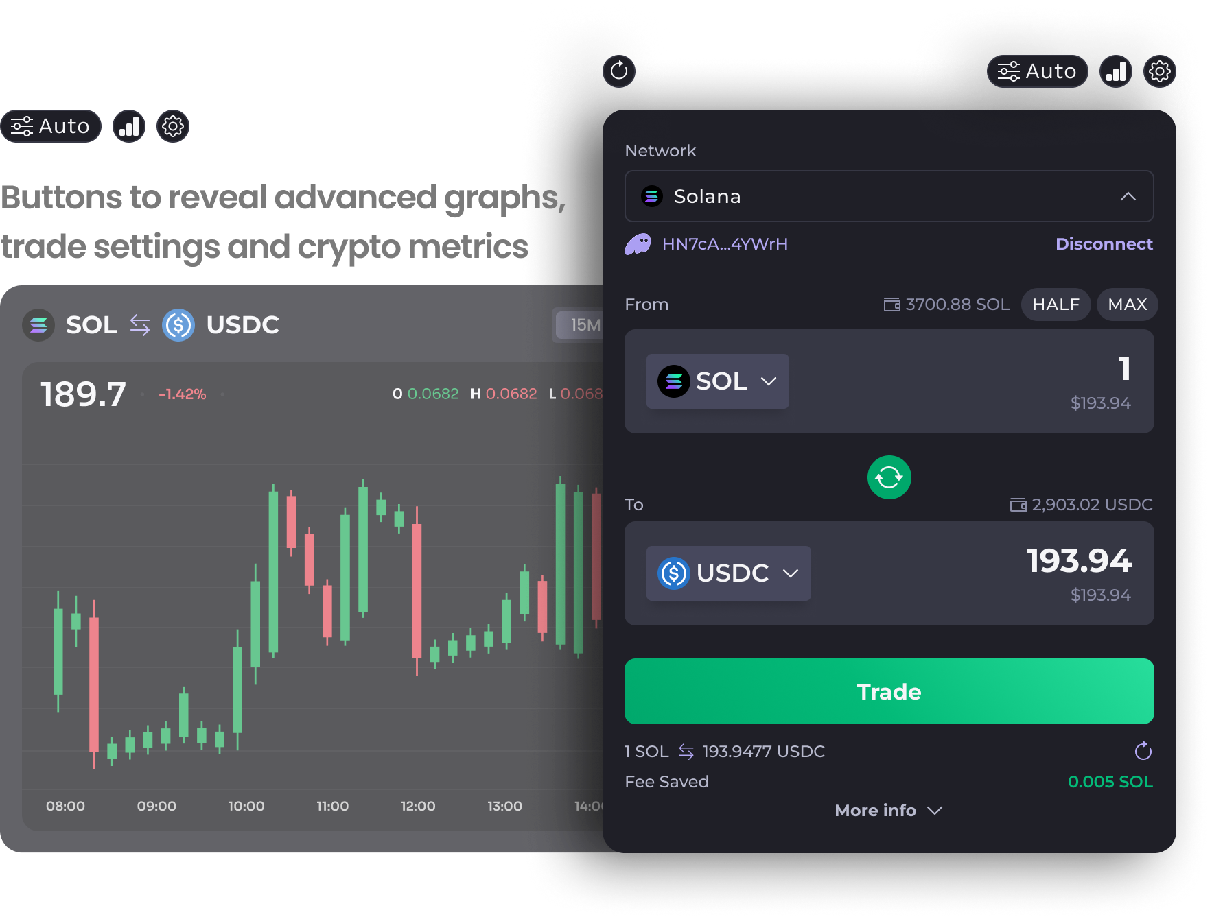
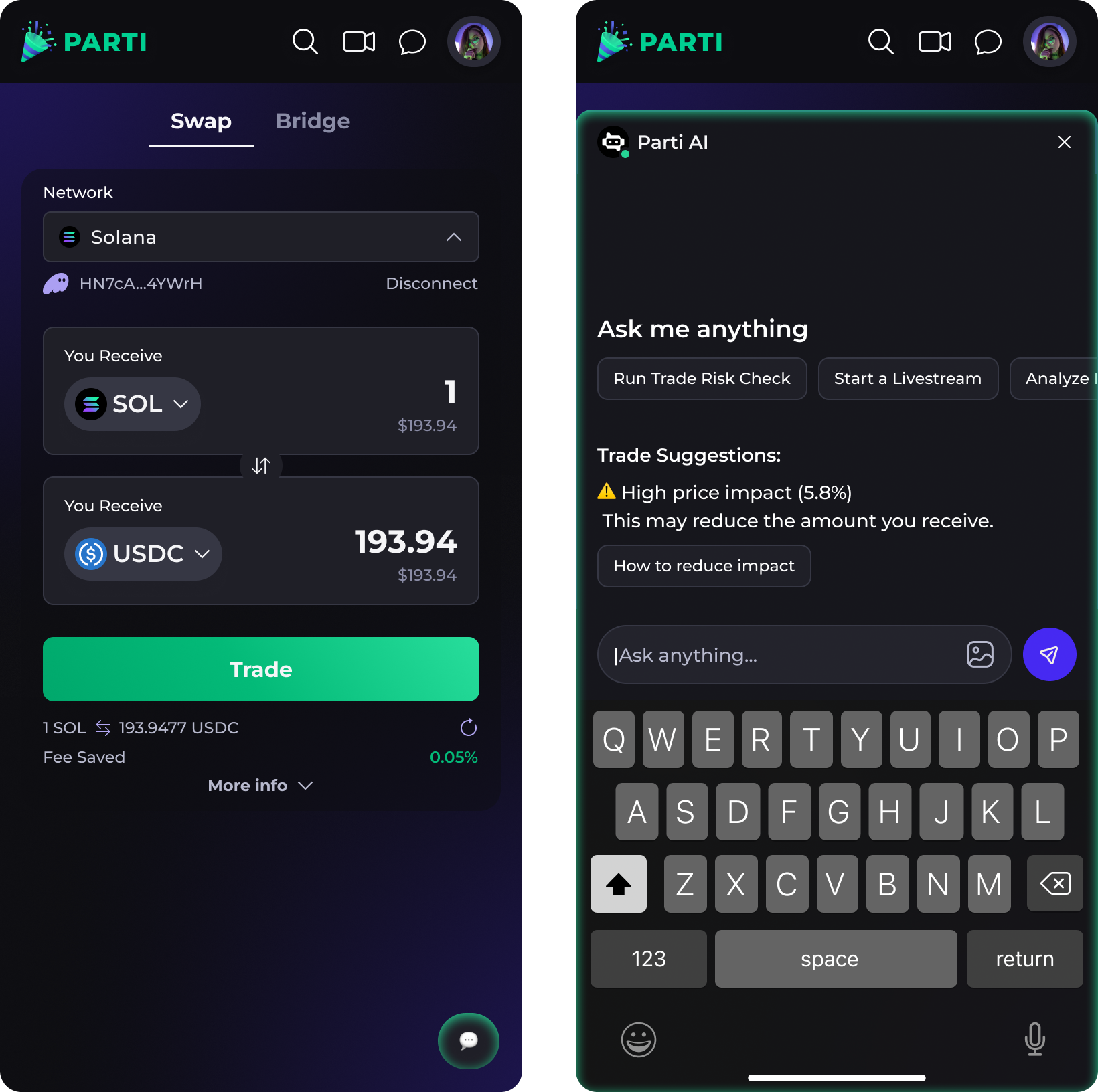
Crypto transaction flows were overwhelming with too much data, limited guidance or error prevention.
Impact: Users abandoned transactions mid-way.
Engagement features such as tipping in chat or gifting subscriptions lacked guidance on its impementation.
Impact: Users underutilized revenue-driving features.
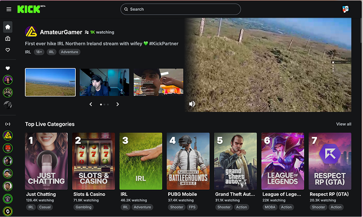
Competitive Analysis
Researched industry standards and user expectations to uncover opportunities for differentiation.
Bright Accent Color
Web3 design trend of a dark background with a bright accent color
Clean UI Design
Organized layout for easy scanning and navigation of content
Clear Data Visualization
Reduces information overload and clutter
Large Search Bar Centered
Search bar and main actions always accessible on side and top bar
Define Goals
Synthesized research data and presented findings to Stakeholders, PM and engineers. We identified project goals that align with business requirements and user feedback.

Visually appealing redesign

Improve usability & navigation

Increase user engagement
Leading Cross-Functional Meetings
I facilitated weekly checkpoints with founders, engineering and product to align on priorities, negotiate trade-offs, and champion user needs across competing objectives. I had daily check-ins with engineers, where I would send my Figma File and sometimes offer HTML & CSS code directly when I had a specific change in mind. I incorporated them early into my design process to ensure technical feasibility and practical implementation.
Modern Visual UI
Users felt the original color palette lacked vibrancy and visual impact. For the redesign, I preserved Parti’s brand colors to maintain identity and recognition, while enhancing them to create a more dynamic, engaging visual system.
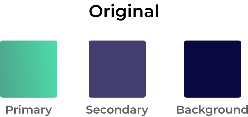
• Low contrast = overuse of purple
• Dull & muted color palette
• Unclear visual hierarchy
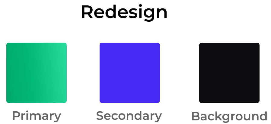
• High contrast = Vibrant accents + dark background
• Colorful, distinctive Web3-inspired visual identity
• Strong visual hierarchy