Spend less time on email. Let's get you to inbox zero.
Owned 0-to-1 development of a subscription-based AI email mobile app using pioneering AI features that increased business productivity, profitability and customer satisfaction.
My Contributions
- Project Management
- UX Research
- UI Design
- Competitive Research
- Developer Handoff
- Hi-Fi Prototype
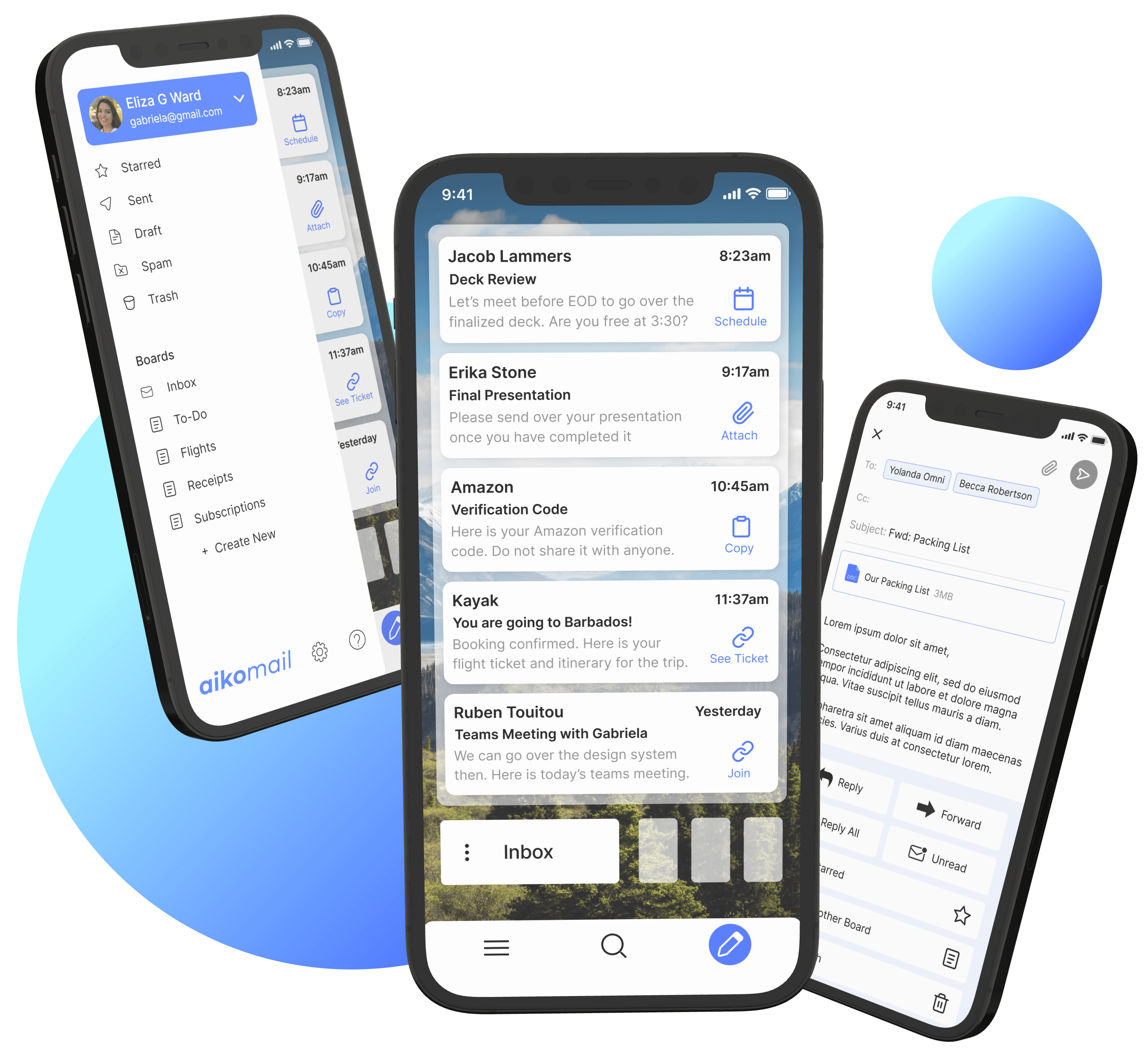
Create a new mobile email experience that is efficient for email usage utilizing pioneering AI features
I drove the vision to launch Aiko as a mobile app, enabling users to seamlessly access its capabilities on the go. I reimagined email for mobile, translating our desktop-first AI features into an intuitive, differentiated experience to create a product that stands apart from traditional email apps.
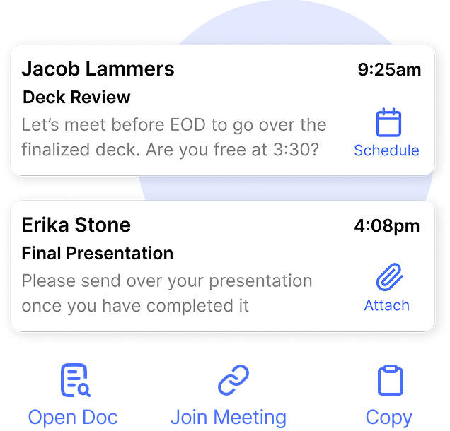
Smart AI Messaging
Dynamic, context-aware email suggestions that guide users through tasks efficiently, personalized for their workflow.
Interactive AI Demos
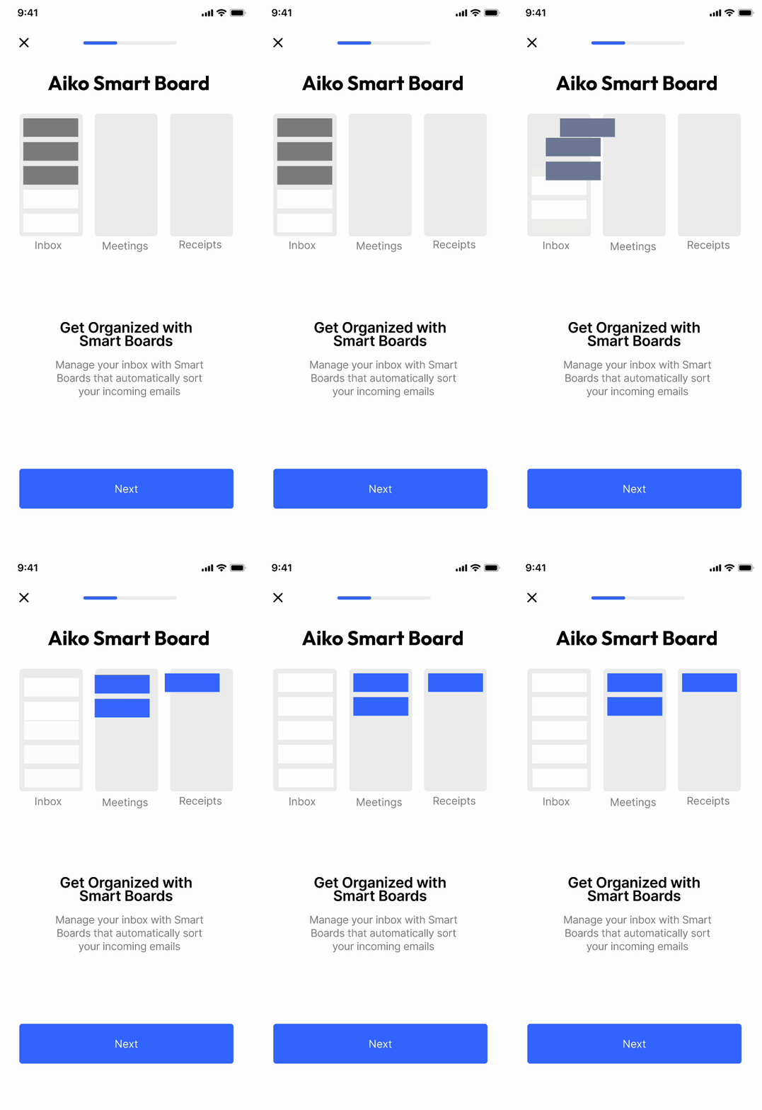
Embedded, lightweight tutorials and tips that helped guide users through the new AI features.
Empathize
Understand the user problem through User Interviews and Research Expert opinions

Specify
Analyze Findings, identify goals and prioritize features based on findings
Ideate
Create user flows & low fidelity wireframes to explore design posibilities
Test
Test the design against users to gather feedback and ensure it solves a problem
Design
Based on feedback from users & engineers, generate hi-fi designs for the mobile and desktop app
Finalize
Create a prototype of the application for final feedback
Competitive Analysis
To find more gaps in the market that we could fill, I conducted competitive analysis on existing mobile email apps with the most clients. I did a SWOT analysis of two competitors: Gmail and Apple Mail. This allowed me to scope any strengths and weaknesses, which I could improve with my app.
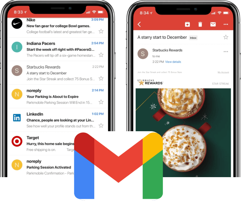
Gmail
Strengths
○ 28.13% of email client market share
○ Several organization features to categorize, group and filter emails
○ Organization features do not give desired result
○ Third party extensions are not accessible on Mobile
○ Allow for the usage of extensions on the Gmail App
○ Display categorized emails in an improved visual manner
○ Other email applications such as Apple Mail available in the market
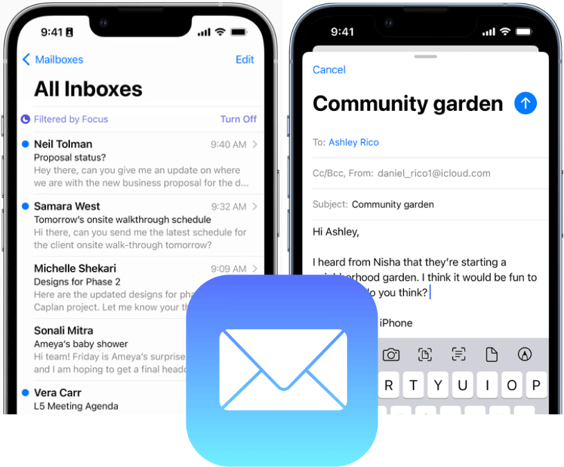
Apple Mail
Strengths
○ 59% of email client market share
○ View multiple accounts individually or together on the app
○ Preview any
given email without opening it
○ Usability is not intuitive i.e. adding attachments
○ Addons and extensions are challenging to implement
○ More intuitive access to features i.e. attachments, search function
○ Welcome addons and third-party extensions for improved user
experience
○ Other email applications such as GMail available in the market
Focus Group with Users
To better understand our users experience first-hand, we conducted a focus group with 7 email users that fit Aiko's main target audience, which are employees and employers who frequent email app's everyday. I organized the data through affinity mapping, and the main insights of the research shared that:
Users receive many emails of varying priority levels in one inbox, which can overshadow more important emails. They waste time manually prioritizing the importance of each email by uncovering its purpose and due date.
Even when apps offered automatic filters, instances occurred of emails being incorrectly filtered or sent to junk folders. Not to mention unwanted spam that made its way into users' inbox.
Users kept bringing up having issues looking for features to help complete tasks, such as forwarding an email or adding an attachment
The findings from my user interviews and expert research conclude the need for strong usability, functionality and security, as this will solve user problems and contain essential features that make a crypto exchange app successful. Below are the goals for the project:
Goals
Solutions



Wireframes to Native iOS Components
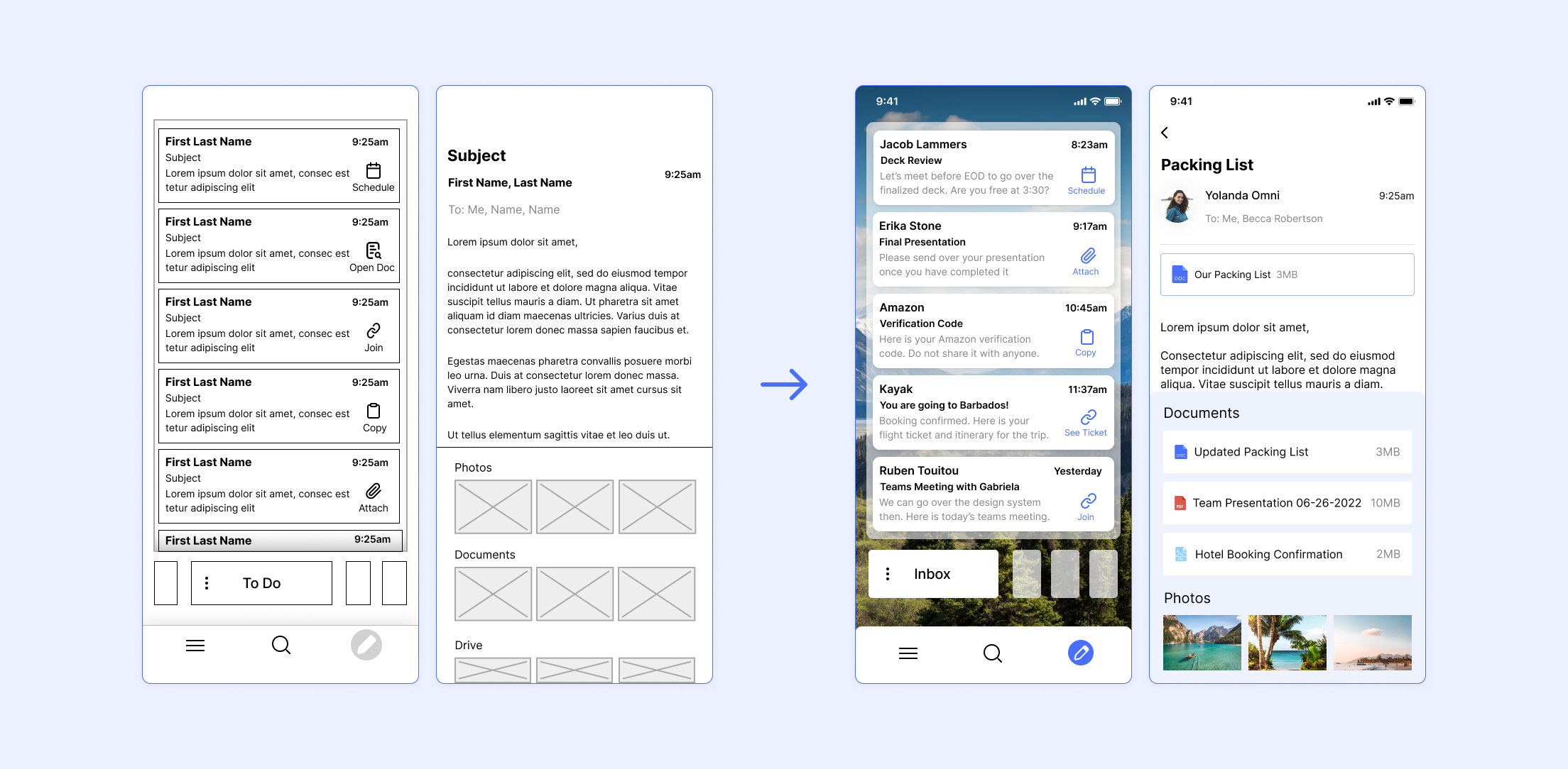
The following images show the progression from initial wireframe designs to the final native iOS components.
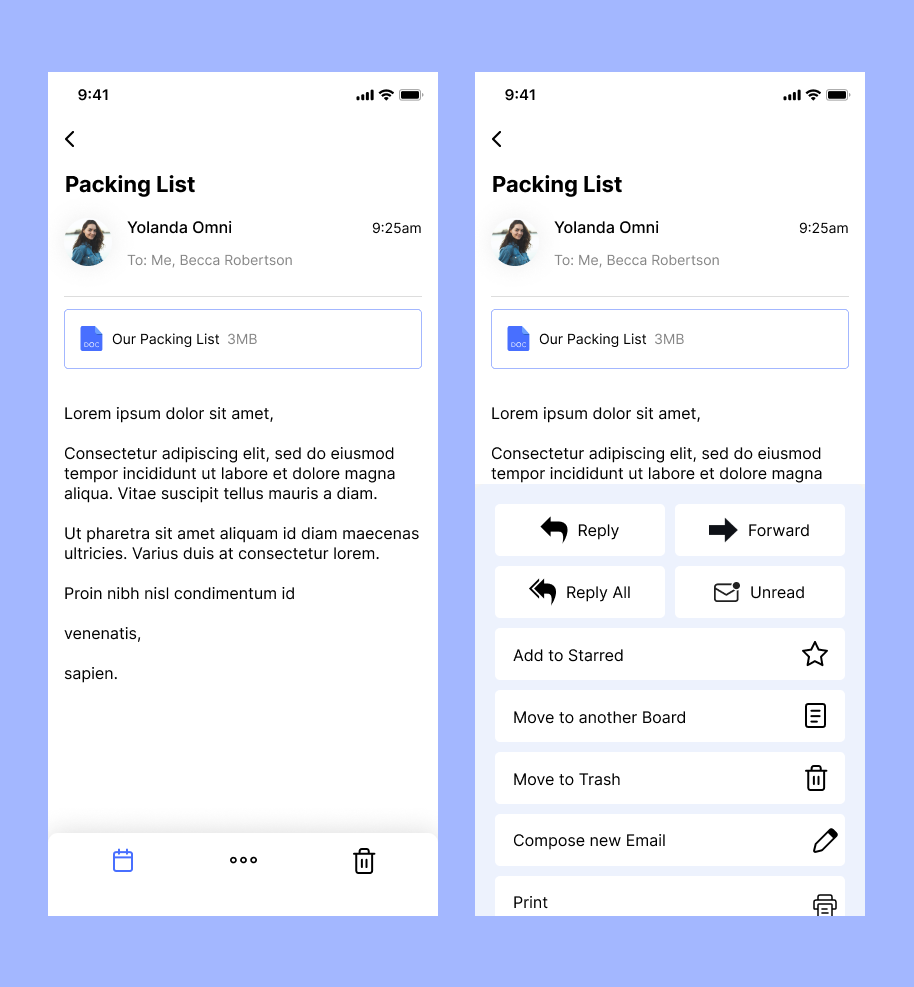
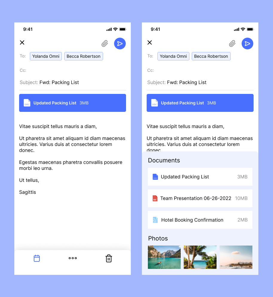
User Journey → Adding Attachment to Forwarded Email
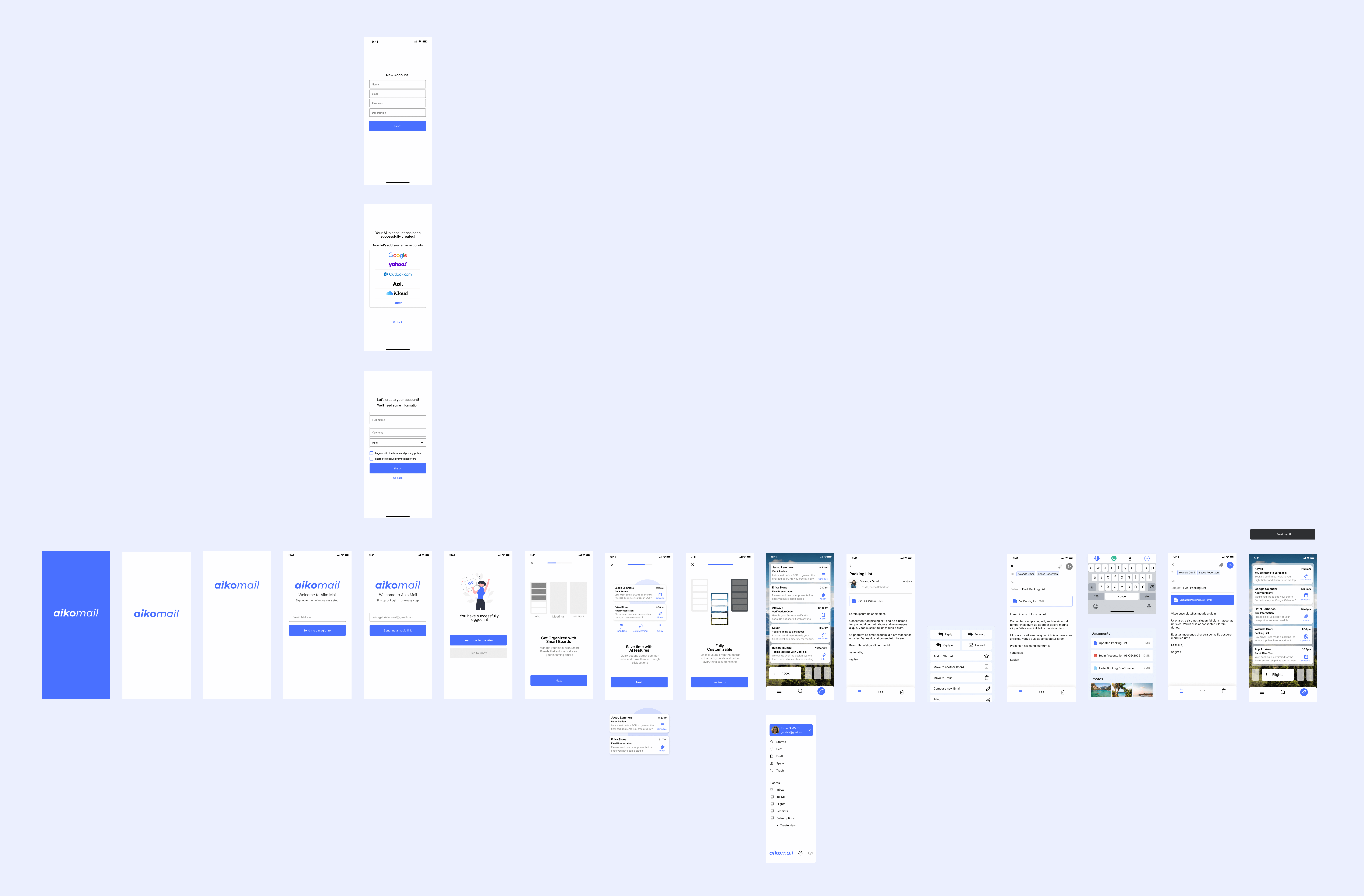
Having an interface that is easy to navigate and complete tasks is one of the main goals for this project. This user flow contains the onboarding process when users first sign into the app and demonstrates how easy it is to add attachments to a forwarded email, which is a task users in the focus group shared is frustrating to complete with existing email mobile apps.
Open App -> Create Account -> Onboarding Screens -> Inbox Page -> Open Email -> Click Menu -> Select Forward -> Click Attachment -> Add Attachment -> Send Email -> Receive notification that email has been sent
Innovative Email Scroll
The most challenging goal was to include Aiko Mail's AI smart board feature, which uses AI technology to automatically organize user emails onto different boards. I created this onboarding animation to demonstrate to users how Aiko Mails AI smart boards work when they first log into the app:

Ideally, users should be able to read and move their emails to different boards just from the preview. Most email apps used the hamburger menu to switch emails between categories, but we wanted to design something thats newer and faster. I created many sketches and design variations to figure how users could scroll between boards to view them while also drag & drop emails into them.